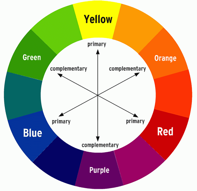
Speaking of cinematography, I had an interesting conversation with Dan Kachula. He mentioned how film used complimentary colors to attract the images to the viewers eyes. At first I didn't get what he was saying until he explained how hollywood have been using a useful technique in colors.
Holly would use two opposing colors in their compositions. What do you mean? Hollywood would take the positive (subject) and subtract the negative (background) with colors. In other words, since we people are yellow/orange tint, the background would be the opposite color (in this case, blue/green).
Wow!!! It blew my mind in seconds. I felt like all the things I learned in art class, as far as color, started to finally come together. I remember recommending my brother to choose blue and orange color because they are complimentary colors.
And lets not forget the traditional christmas colors, red and green! and then purple and yellow. You would have learned this if you took any art classes.
When Dan finally meddled with my brain, the first thing that came on my mind was a popular show called "Breaking Bad", it all made sense to me now.
So when I went home. I kept in mind to spot out this "opposite colors" concept for the next film I watch, "Fringe". And what did I discover? Let me just share the snapshots I took;
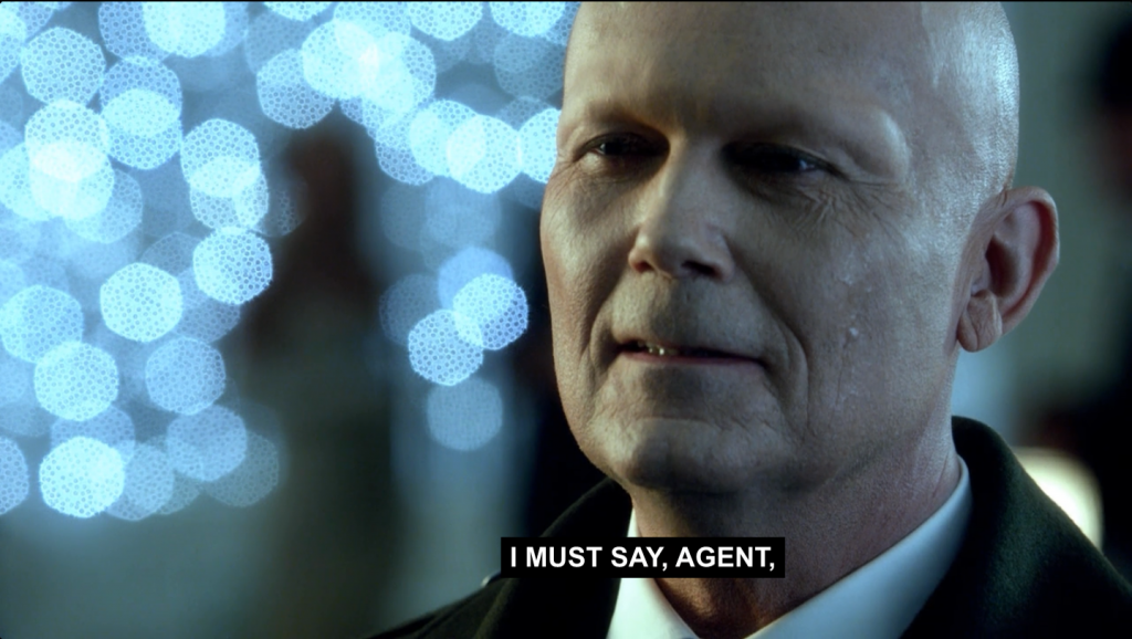
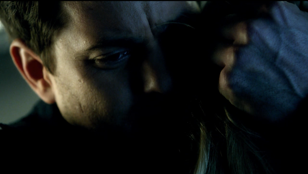
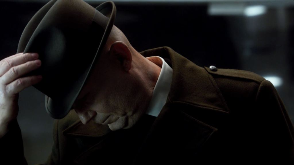
Just look how they light the subjects (characters) one side is blue, the other is red/orange! I gave me a good laugh after learning the revealing truth! No matter how tinted the colors are, you will always spot the difference in colors. Isn't this awesome?
It makes sense since they need to use this concept as dramatic cinematography, here's why;
warm/cold
blue or teal/orange
negative/positive
foreground/background
these terms may not makes sense to you since if you haven't studied composition and art. Easy way to explain this is these opposing portions will make the composition just pop out in hard contrast. It's not black and white, it's seeing the black and white in the grey color!
suffice to say, I will share some of my work that turned out to fall in this category ;)